The movie poster for Elena is an incredible graphic representation of the film. It’s rare to see such a good story synthesis incorporated into one design. Here is the story of the making the poster in the words of Adrian Curry from Notebook, a sought after and highly referenced movie publication for mubi:
“(…) Sam Smith has become one of the most sought-after designers on the independent film circuit with his refreshingly simple, witty and indelibly striking hand-drawn designs (it doesn’t hurt that he also has a great knowledge of both film history and the history of movie poster design). (…)
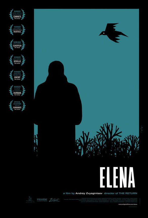
Zvyagintsev’s dark and beautiful film premiered at Cannes (…) where it won the Special Jury Prize. For the US (…) release we wanted to emphasise the noirish aspects of this captivating modern Russian crime drama and none of the keyart we’d seen from Europe really captured that aspect of it (though I am quite fond of the Australian poster).
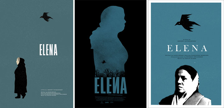
Sam, with his love of Czech posters of the 60s and 70s and their frequent animal iconography, immediately zeroed in on the crow that appears at the start of the film as a linchpin element for his design. One of my favorites of his early comps featured nothing but a thicket of wintry trees silhouetted against a teal blue sky, and, above the title, that ominous bird. But much as we loved it as a piece of art we felt that the poster needed its titular character or it wouldn’t really be telling you enough about the film (unlike the great Czech and Polish designers, we can’t afford to be quite so oblique). However, the title treatment and color scheme were strong enough to survive throughout successive drafts.
 Sam experimented with a number of ways to represent Elena herself, some of which made her look a little too babushka-like in our opinion, but he quickly settled on the perfect look for his crow.

After a number of variations Sam hit upon the silhouette that is used in the final design. Windows are a major feature of the film (Elena lives with her rich husband in a modern glass-walled penthouse) so to have Elena looking out of the window, her back to us, ruminating, maybe plotting, fits the feel of the film perfectly and also gives her a hint of Joan Crawford at her most devious. Sam refined his horizon of leafless branches reaching up like grasping hands (one of my favorite elements of the poster), and even created his own stylized laurels for the film’s many accolades.
Early in the process, Sam had shown me a bunch of Penguin crime paperback covers (many of them the work of Polish emigré Romek Marber) that he was looking at as a possible direction for the poster. You can see that a couple of them clearly influenced our final look.

Going beyond the call of duty, Sam also made a smaller, pared-down screenprint version of his design which was printed at Kangaroo Studios in his home town of Nashville, TN. His friend Adrian Cobb has made this wonderful short film documenting the process.
You can see more of Sam’s work on his website, and you can read about his process and see more of his favorite posters and other graphic work on his blog Sam’s Myth.